 Coco Holtz
Lather SPF Launch
A daily-wear mineral sunscreen launch for LATHER, built around the promise "We've got you covered."
A season-spanning launch built around the ritual of sun protection, brought to life across email, digital ads, print collateral, in-store signage, and store windows. Anchored by the campaign lines "All glide no goop", "Sunscreen that feels like skincare" "Defend. Nourish. Repeat." the campaign positions LATHER as the authority on daily UV protection that doesn't compromise on skin feel or ingredient integrity. It ran simultaneously across LATHER's owned digital channels and all retail locations.
- Creative Direction
- Campaign Design
- Creative Strategy

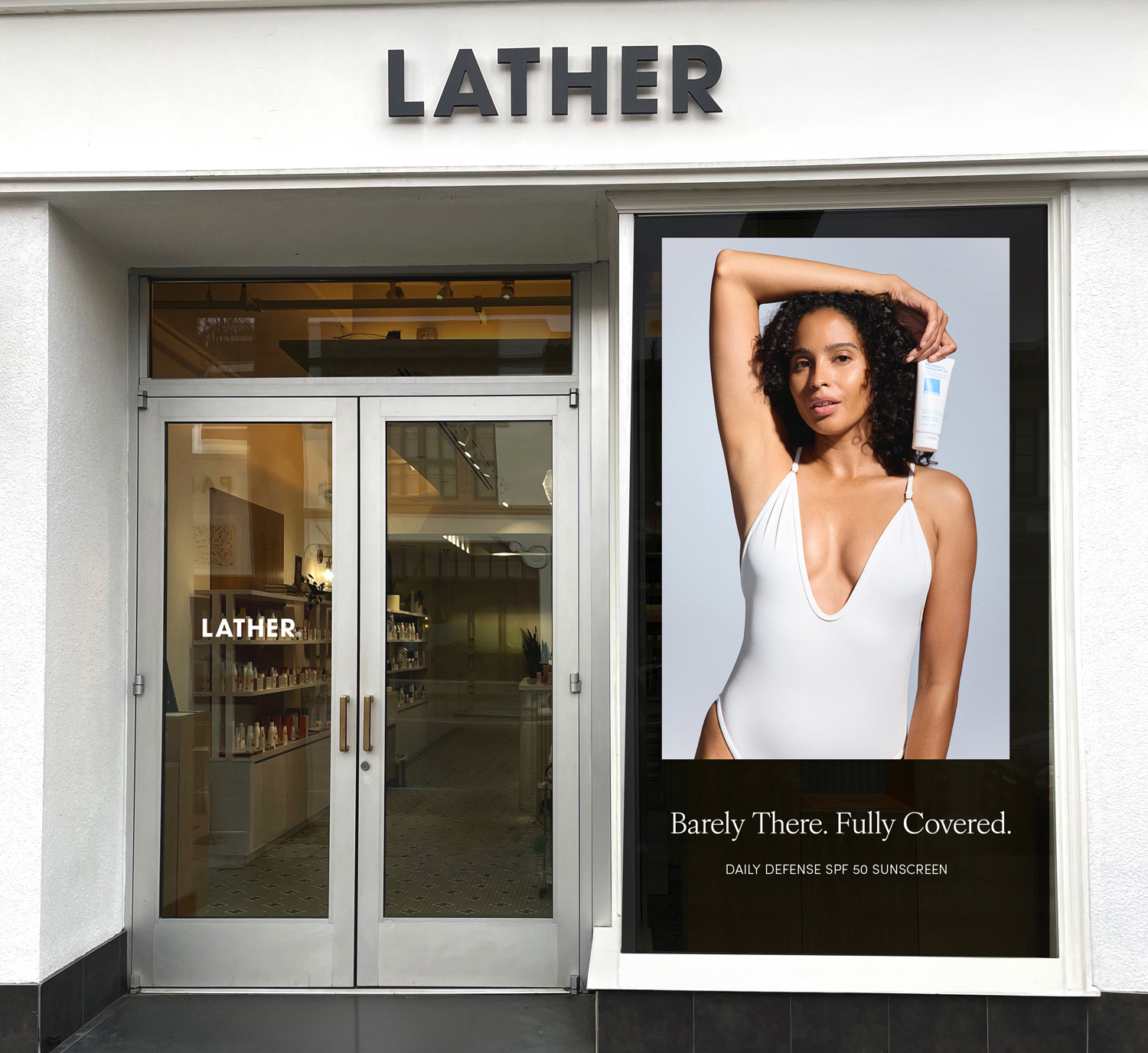
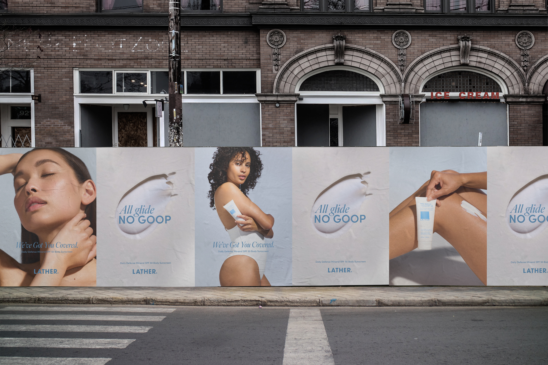
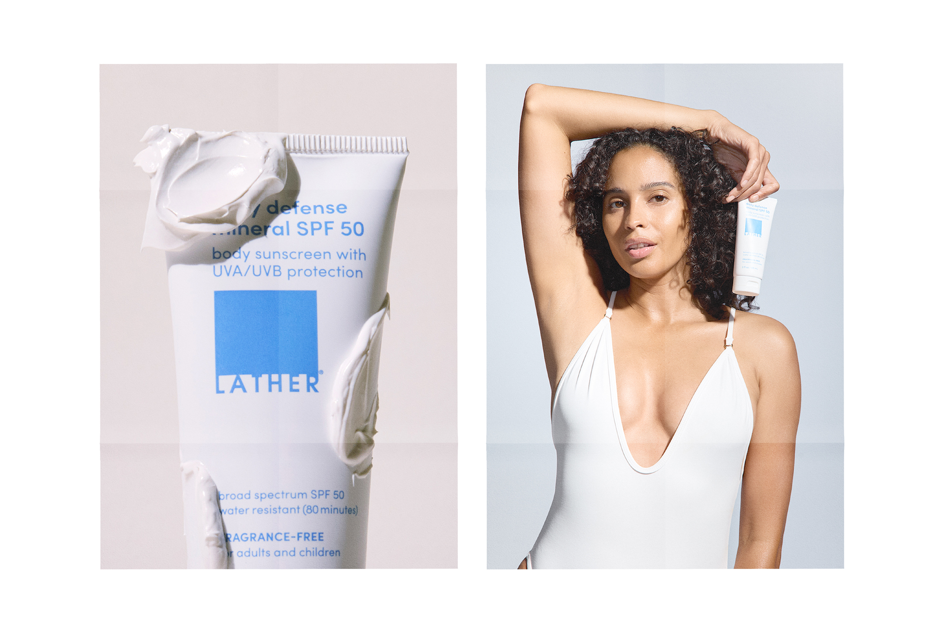
In-Store
The retail ritual
The retail floor was organized around the daily defense ritual — morning application as the final step in a body care routine, not an afterthought. Signage, shelf displays, and testers were anchored by the SPF 50 hero, with supporting product pairings that completed the routine from cleanse to protect. The visual language leaned clinical-clean: white space, clear benefit hierarchy, and direct language that let the product speak.
Customers who had encountered the campaign in their inbox could walk into any LATHER store and immediately find what they came for — or be guided toward a full routine through the ritual lens.
Social
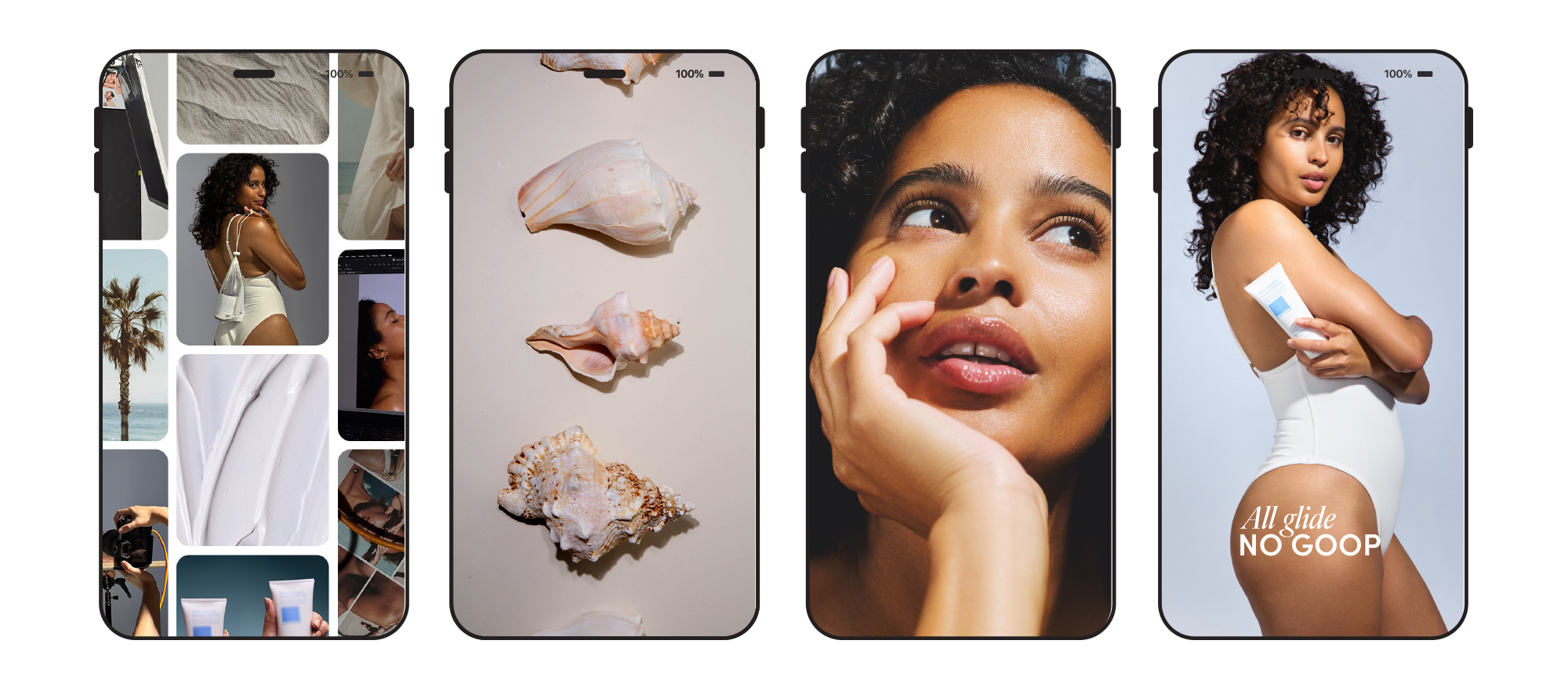
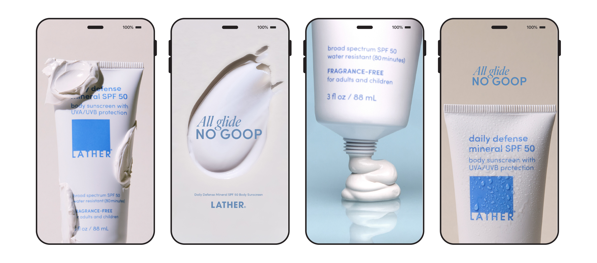
A single protection truth
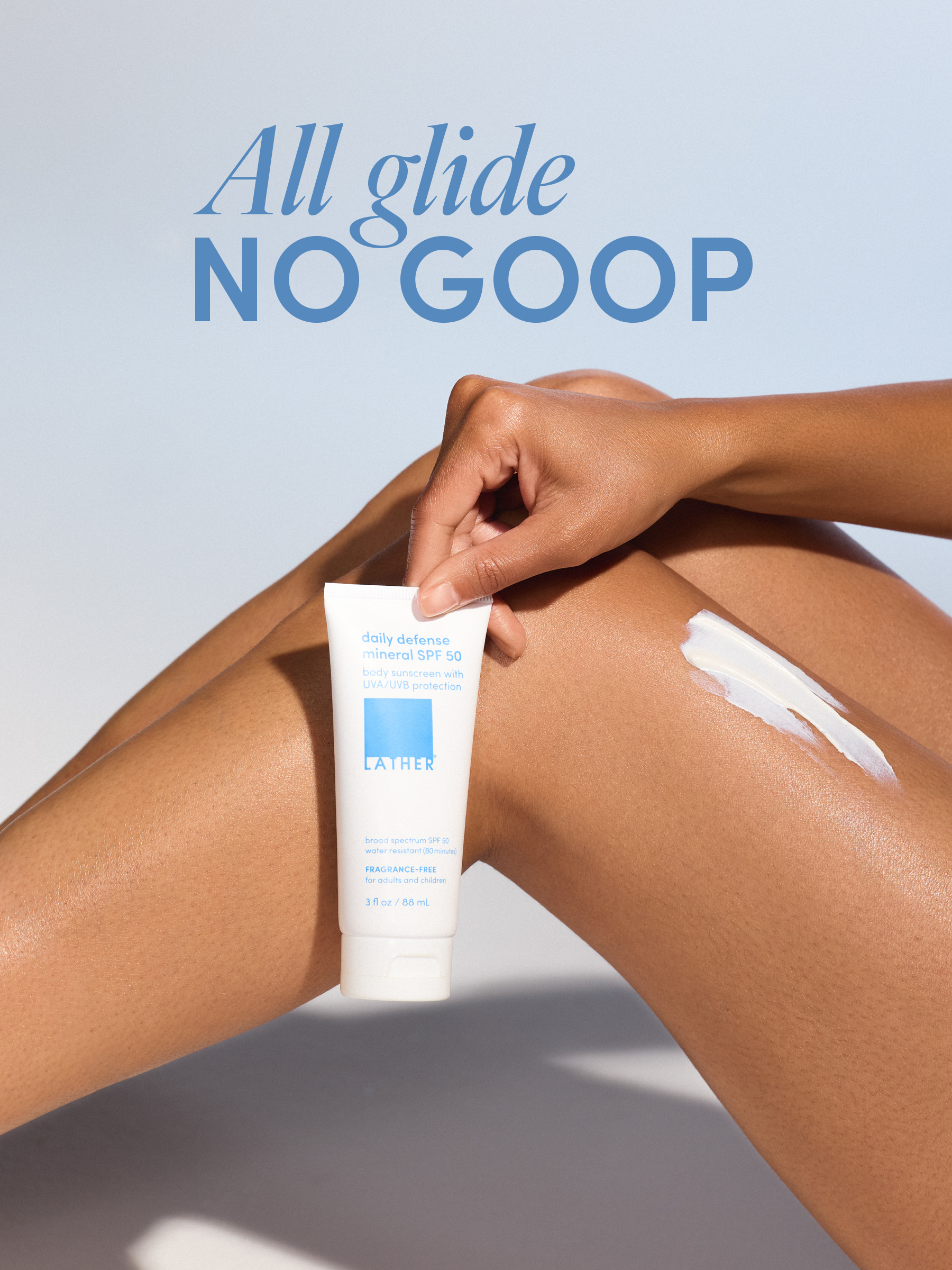
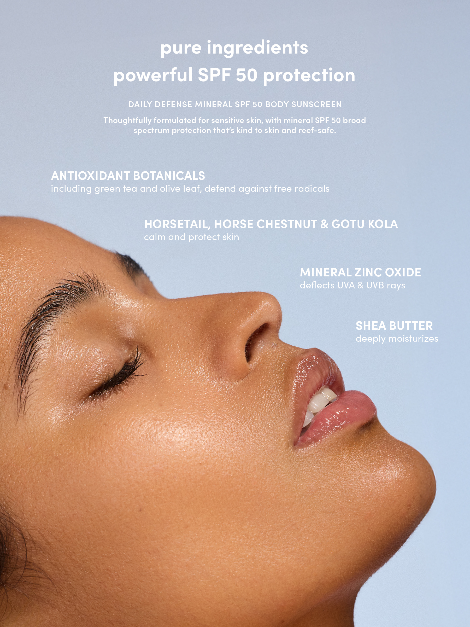
Digital executions extended the protection-ritual concept, reinforcing the benefit storytelling from email while functioning as standalone pieces: visually clean, science-forward, and shoppable. Each post led with a single protection truth — broad spectrum, reef-friendly, non-greasy — before connecting back to the full product story.
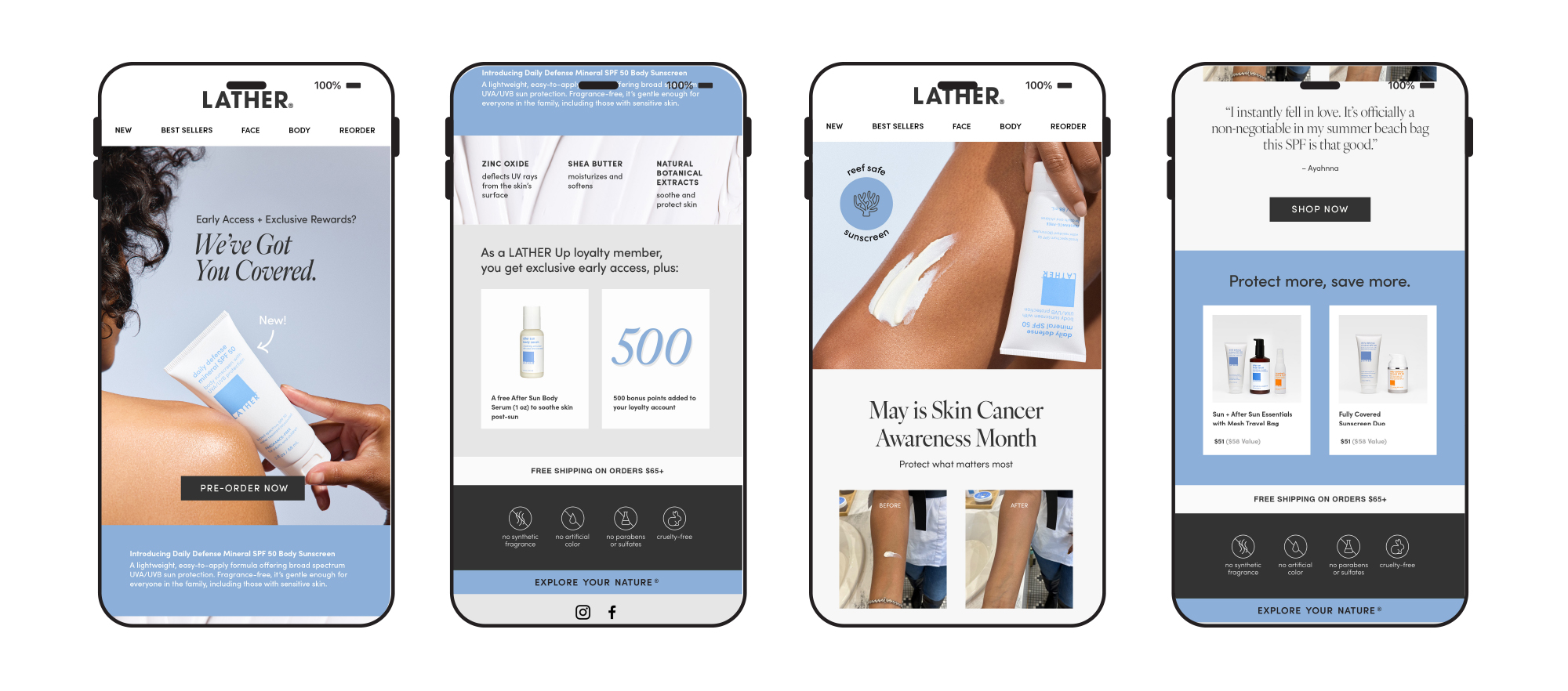
Email Series
Self-care, not a chore
Benefit-led emails deployed across the launch window, each building the case for daily protection from a different angle — SPF education, ingredient transparency, skin feel, routine-building, and real-skin results. Each email followed a consistent editorial format: a single protection truth in the subject line, benefit callouts in the hero, sensory-led body copy, and curated product pairings in the footer.
The tone balanced credibility with accessibility — informed but never intimidating. The goal was to make SPF feel less like a chore and more like self-care.